Brand assets & color guide
The Quidort Marketing brand, ready to use.
Official logos in scalable SVG and PNG, the full color palette, and the five rules that keep it looking right. Free to download for press, partners, directories, and anyone writing about us.
Logos
SVGs are text-outlined. They scale to any size and need no fonts installed.

Full Lockup
Square social profiles, print squares.



Stacked Wordmark
Where the Q alone reads too abstract.


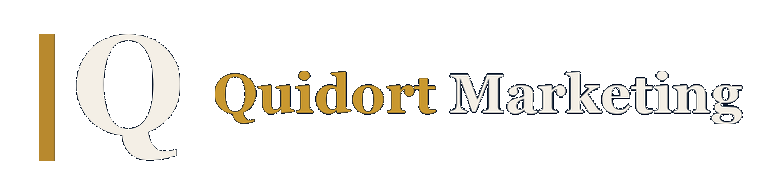
Horizontal Lockup
Headers, email signatures, ad-platform landscape slots (≈4:1).

Color palette
Navy
rgb(13, 27, 46)
Primary ground · logo background
Gold
rgb(184, 137, 46)
Accent · the bar · “Quidort”
Cream
rgb(244, 239, 230)
The Q · “Marketing” · light ground
Gold Bright
rgb(201, 152, 47)
Hover & highlights on navy
Ink
rgb(19, 35, 58)
Body text on light grounds
Navy Light
rgb(21, 39, 65)
Recessed panels · inputs
Navy Card
rgb(18, 34, 56)
Cards on navy
Sand
rgb(234, 227, 212)
Tinted sections on light
Mist
rgb(159, 176, 196)
Muted text on navy
Typography
Source Serif 4 Bold
Display & logo · fallback Georgia, serif
Inter
Body & UI · fallback system-ui, sans-serif
Usage rules
- 1Navy ground first: the solid-navy versions are the default everywhere. Transparent versions belong on navy, ink, or dark photographic grounds. Cream elements vanish on white.
- 2Never recolor. Gold bar, cream Q, gold-and-cream wordmark. No white-on-white, no black versions, no gradients.
- 3Clear space: keep at least the width of the gold bar empty on all sides.
- 4The bar is a rule, not a letter. It is a thin vertical rule at full cap height, half the weight it originally shipped at, set a gap of roughly 3.3x its own width from the Q. Thicken it or tighten that gap and the mark starts reading as the letters IQ, which is how it shipped until 2026-08-30.
- 5Minimum sizes: the mark at 24px, the horizontal at 120px wide. Smaller than that, use the mark alone.
- 6Ad platforms: square slots take the 600×600 PNG; landscape slots take the horizontal (≈4:1).